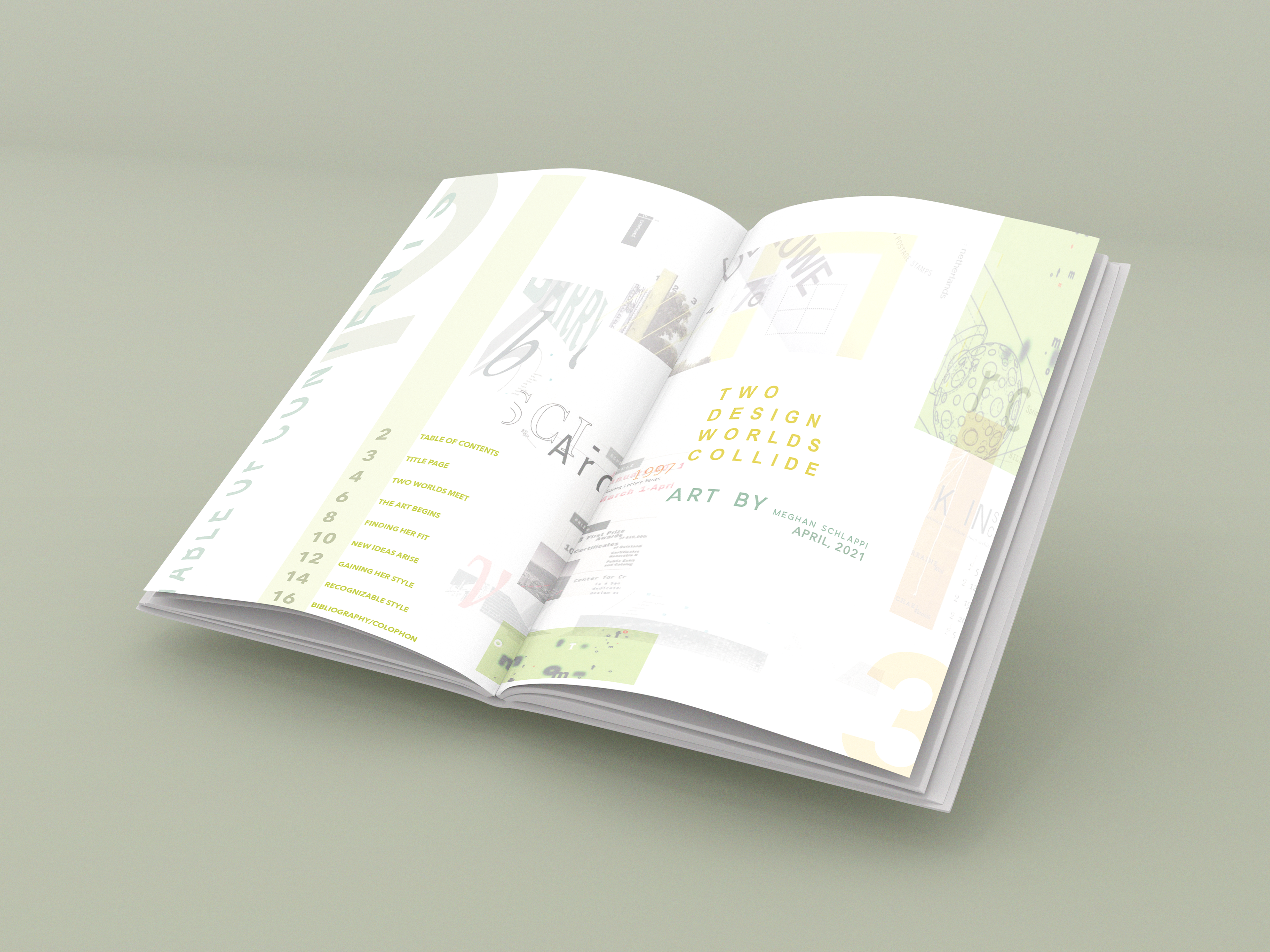
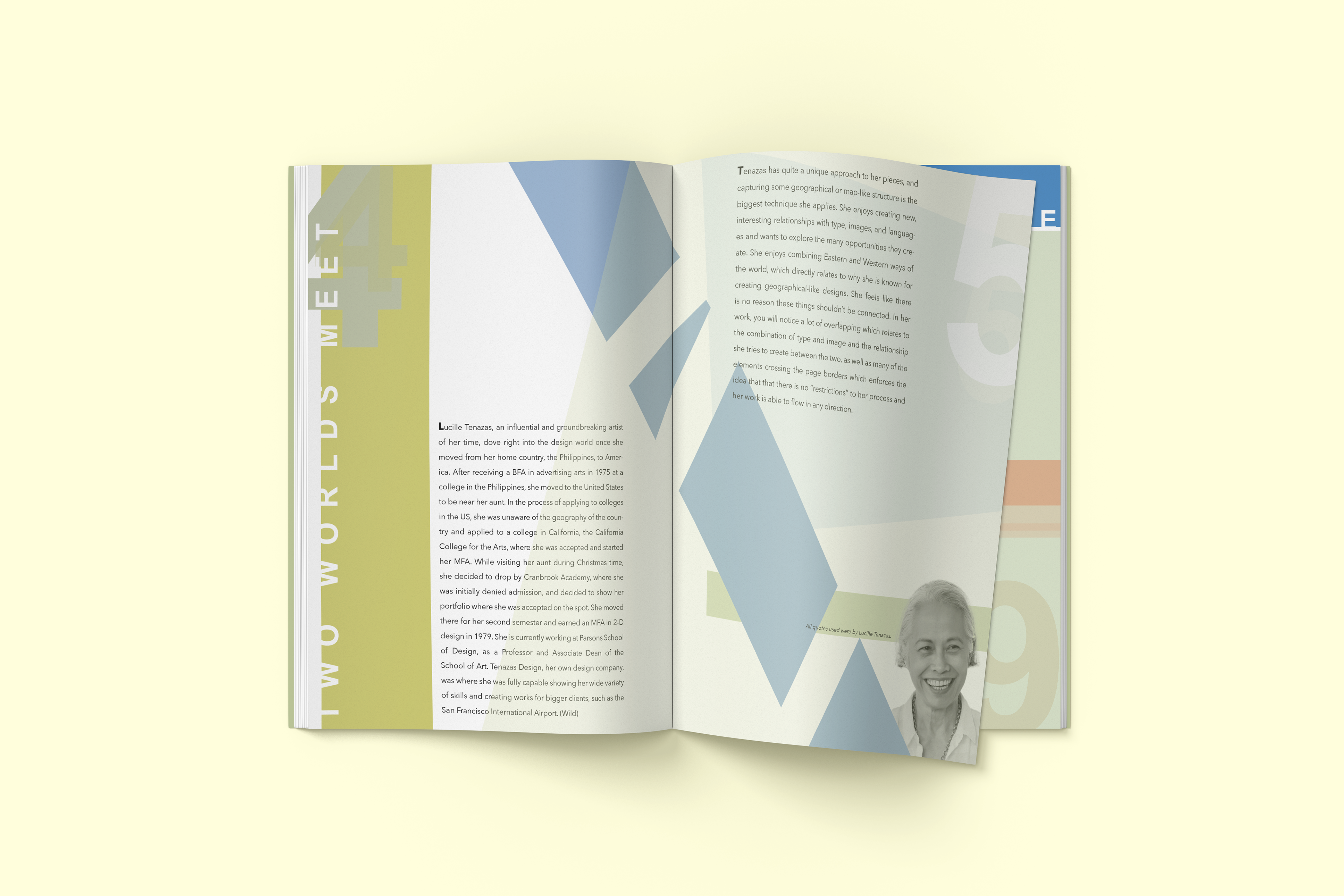
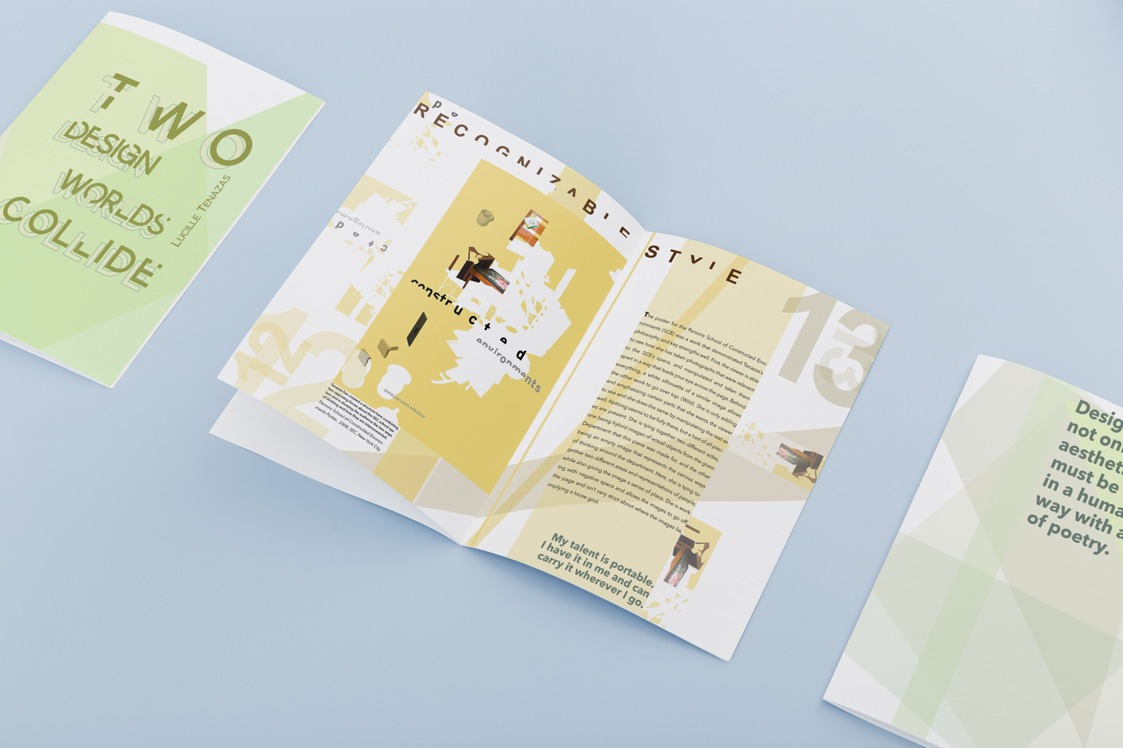
Designing like another graphic designer can be tough, especially when that designer is the iconic Lucille Tenazas. She developed her unique style in the 1970s and has been successful ever since. For this 16-page booklet, I researched her background, awards, education, skills, and current role as a professor to better understand her approach. This research helped me grasp why she makes certain design choices, which guided me in creating the booklet in her style. Her design includes cropped images and text, elements that bleed off the page, lots of overlapping, and a grid that feels like a map. Through this process, I learned how to maintain a consistent style and how to analyze someone else’s work to replicate it effectively.


