Most people know what Yahoo is, but how many actually use it regularly? Yahoo was once a popular search engine in the early 2000s, but it has since lost ground to other big competitors. My goal was to rebrand Yahoo to make it feel more welcoming and organized, creating a space where users could complete all their daily tasks in one place. To achieve this, I chose colors that symbolize growth and new beginnings, used rounded edges to make the design feel friendly, and created a circular logo to represent the ongoing support Yahoo provides its users. The new logo features the two O's in "Yahoo" intertwined, adding a friendly touch, while the circular shape ties in with the overall theme of continuity and support.
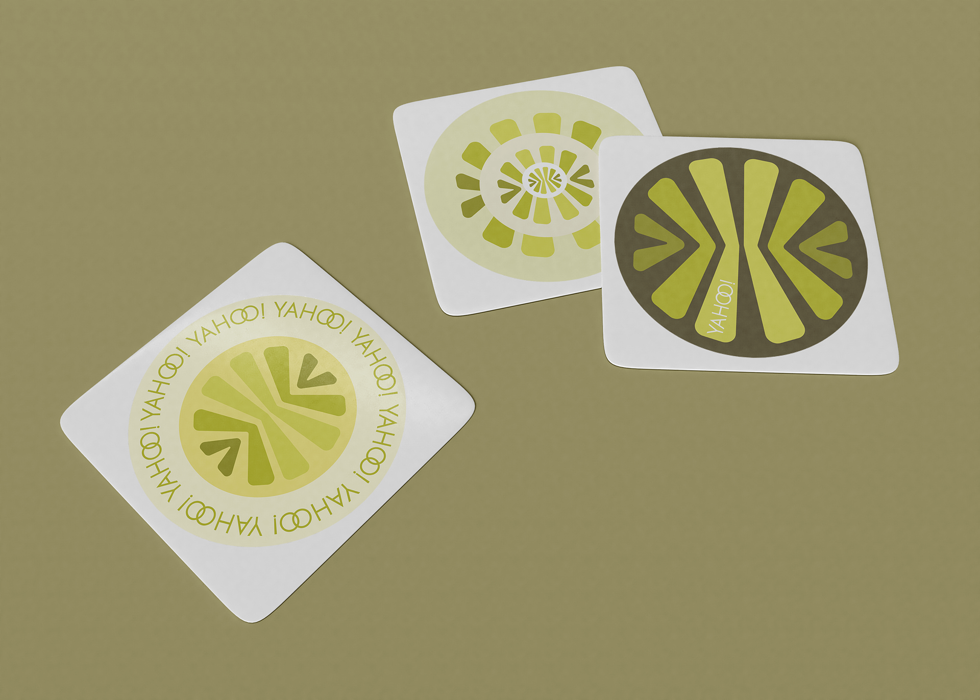
Stickers that may be given out in PR boxes.
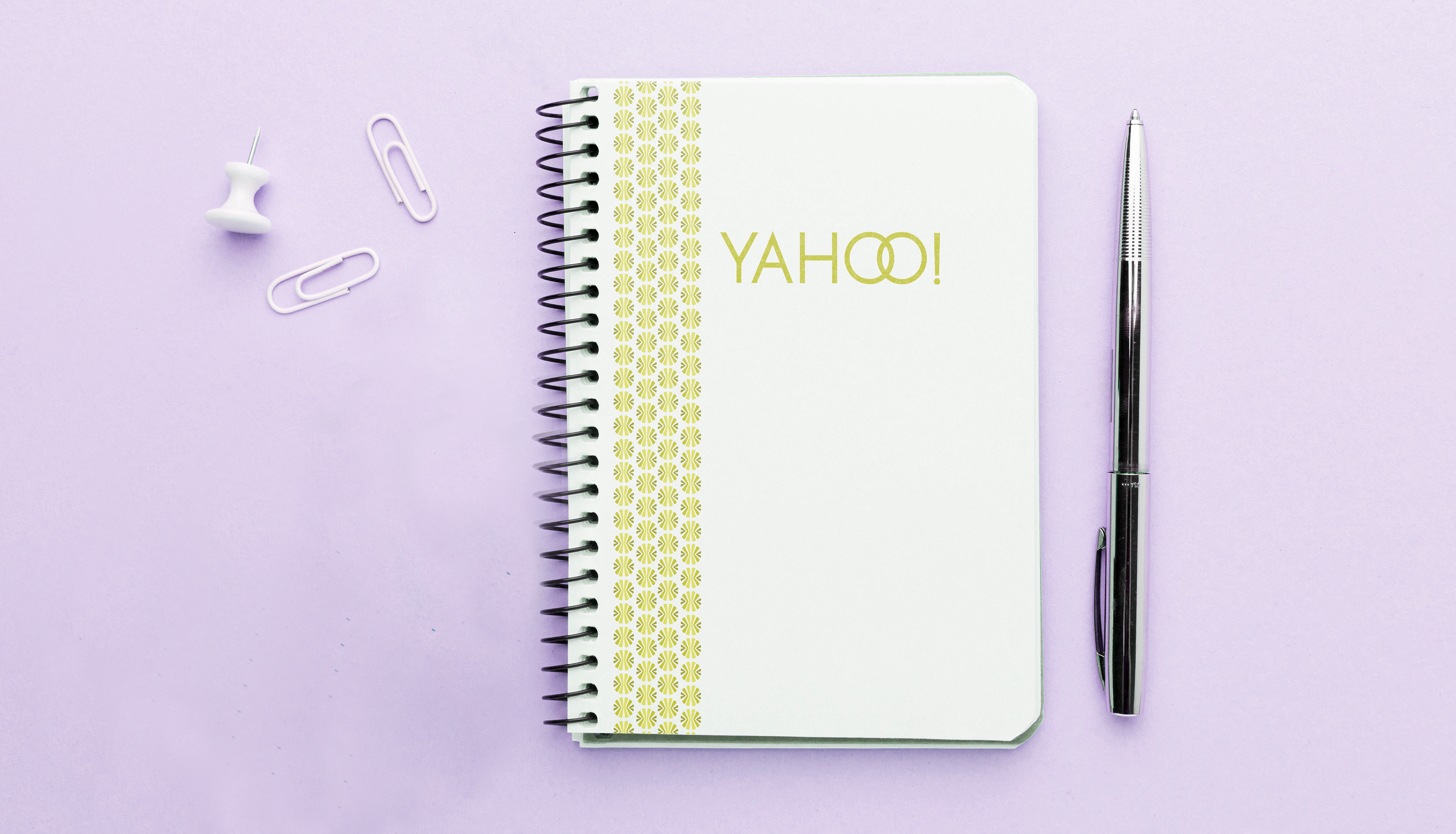
A notebook a Yahoo! employee may be given to work in
